
Beginner's Guide to Candlesticks Charts
Candlesticks charts are a type of chart that combines multiple candles to graphically represent the price movement of a given asset within a specific timeframe.
What are Candlestick Charts?
Candlesticks charts are a type of chart that combines multiple candles to graphically represent the price movement of a given asset within a specific timeframe. They are mainly employed by traders in financial markets to estimate price movement based on the previous candlestick patterns formed.
Candlesticks charts were first developed in 1700 by a Japanese rice trader named Homma, who discovered that the price of goods (such as rice) varied on supply and demand forces which were in turn influenced by participants in the market. Homma’s discovery was redefined mainly by Charles Dow, who helped to create modern-day technical analysis and candlestick charts.
Basics of candlesticks
A candlestick visualizes the price’s open, close, high, and low. For example, if a trader selects the daily time frame, then each candlestick will represent the open, close, high, and low of each trading day.
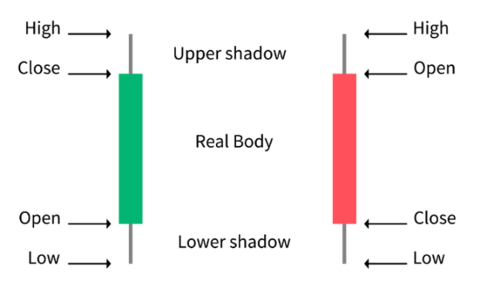
Anatomy of a Candlestick
Below are examples of two candlesticks. Notice that the different colors represent different meanings.
Source:https://www.coindesk.com/markets/2018/06/23/crypto-trading-101-a-beginners-guide-to-candlesticks/
Body: The body is the wide middle section of the candlestick depicted by the open and close price within the specified time frame. It can be either Green or Red. A green candlestick represents the price of an asset closed at a higher price than its opening price. Alternatively, a red candle represents that the closing price of the asset within that candlestick was lower than the opening.
Wick or shadow: The is the upper wick and lower wick. The lower wick represents the lowest price reached by a trading asset within the candlestick, while the upper wick represents the highest price reached.
Open: Represents the initial deal of that trading period.
Close: Represents the last trading price of that period.
Notice that the close on a green candlestick is high than the open and vice versa with a red candlestick.
High: Represents the highest trading price reached by an asset during a trading period.
Low: Represents the lowest trading price reached by an asset during a trading period.
Candlestick patterns
After becoming familiar with the basic structure of a candlestick chart, then it is time to look for various patterns which will help to illuminate trends. There are three main types of candlestick patterns
Bullish: Bullish pattern candlesticks denote an increase or potential increase in price over time and are represented by continuing patterns such as Bullish Harami, Bullish Engulfing, Morningstar, or Three white soldiers.
Bearish: Bearish pattern candlesticks denote an increase or potential increase in price over time and are represented by continuing patterns such as Bearish Harami, Bearish Engulfing, Evening star, or Three Black crows.
Ranging: The upper and lower wicks are almost equal, and the body is relatively small. This illustrates that the market is indecisive about the trend. Moreover, it also illustrates that the bulls and bears are equal. This is mainly represented by a Doji candlestick. It can signal a ranging period in the market (sideways movement) or a reversal in the current trend.